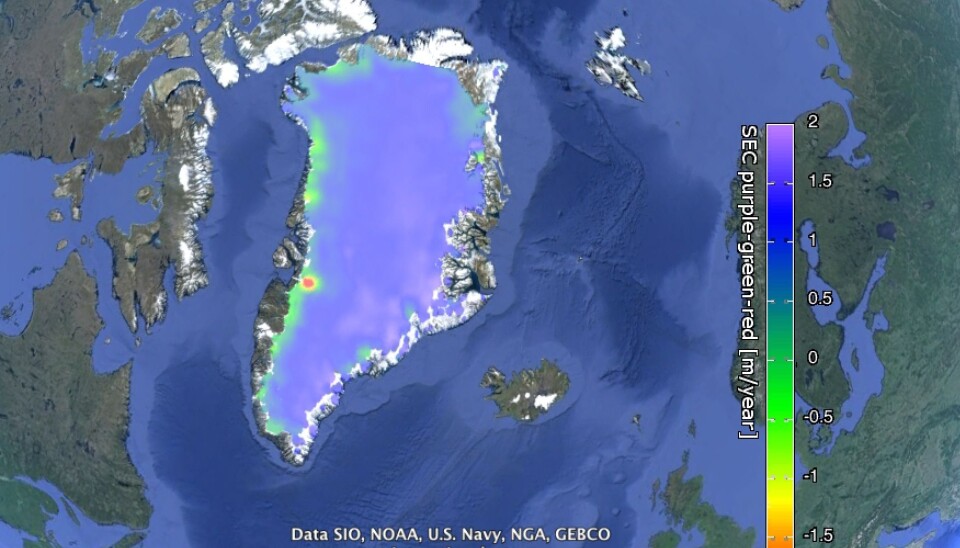
Calling all armchair scientists: ESA releases Greenland satellite data
The European Space Agency launches website with access to satellite data, images, and animations of the Greenland ice sheet.
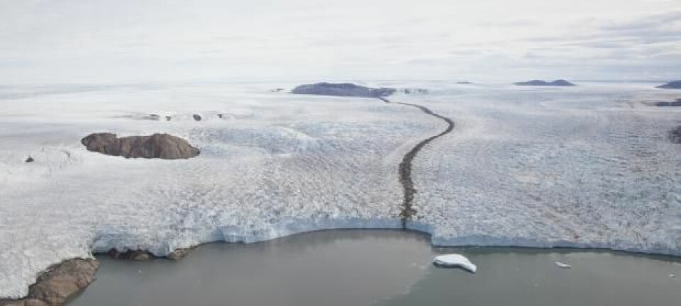
Do you want to see exactly how the ice on Greenland has changed in the last 20 years? Well, now you can.
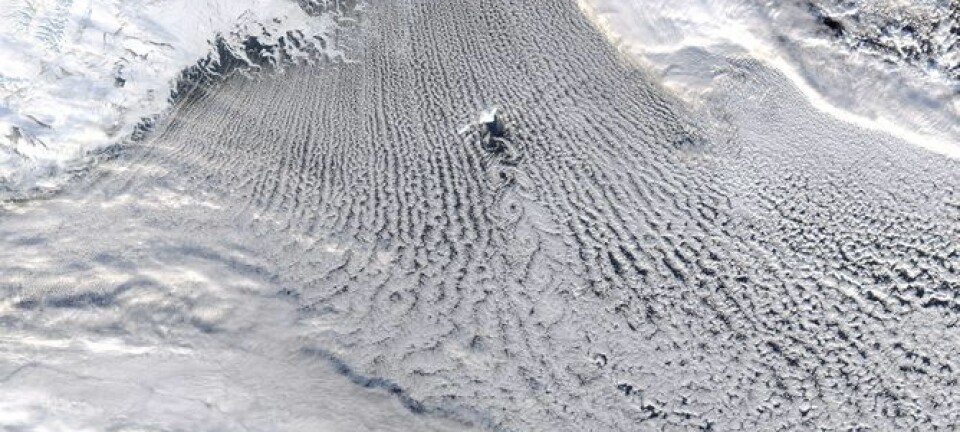
The European Space Agency (ESA) have launched a new website with full access to a collection of their satellite data, images, and animations covering the entire Greenland ice sheet.
“This is a big project funded by ESA, which is making some of their data for detecting climate change in Greenland available to everyone,” says Louise Sandberg Sørensen, a researcher from the Technical University of Denmark (DTU) and one of the scientists behind the project.
“It’s great because it’s no longer just scientists like me that can access this data,” she says.
You can download data via the new website, and see for yourself exactly how the height of the ice sheet has changed, and how fast and where the ice is melting.
Satellite data for all
The website includes data from the CryoSat mission--ESA’s first satellite dedicated to monitoring sea and land ice changes over Greenland and Antarctica.
CryoSat has a special piece of kit on-board, a so-called radar altimeter, which maps the surface of the ice sheet and glaciers.
“A radar altimeter works like a fish finding sonar that measures the depth down to the bottom of the ocean. We do basically the same thing--but from space,” says Johan Nilsson, a former PhD student from DTU Space who currently works as a postdoc researcher at the NASA Jet Propulsion Laboratory.
“It sends down a pulse, which measures the height of the ice sheet, and from this we can build up a picture of the topography of the entire ice sheet and how that changes over time,” he says.
Nilsson stresses just how crucial these measurements are for other scientists, who are trying to understand how the ice sheet is changing.
“My part of the research is to provide the best possible observations to the modelling community so we can understand what the future will bring in terms of increasing sea level,” says Nilsson.
“They need these satellite data to calibrate and validate their models, so of course the better measurements we have, the better predictions they can make.”
The Polar Regions will change first
The Polar Regions are considered one of the most sensitive parts of the world when it comes to climate change. It is here, according to Nilsson that the effects of climate change are felt first.
“This is the canary in the coalmine scenario. The Polar regions are the parts of the world that will be affected first [by climate change], and with the highest magnitude,” says Nilsson.
Sørensen hopes that by making these data available to everyone, it will help people to visualise the changes as they happen.
“We cannot feel or see if the temperature rises by 0.5 degrees or if the sea level rises by one millimetre, but we can really see changes happening in Greenland,” she says.
