Charles-Joseph Minard’s map of Napoleon’s flawed Russian campaign: An ever-current classic
Some data visualisations can be perceived as something more than figurative representations of numerical or statistical analyses, and certain examples of infographics give us something more than simply visual information.
Often it is the design that fascinates us, and even the idea it expresses.
Sometimes it is also the objective that fascinates us.
In the history of data visualisations, there are some examples which stand out in that way, and constantly arouse such attentions.
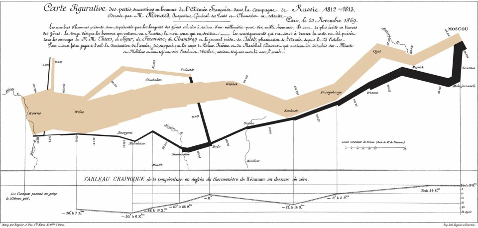
The Frenchman Charles-Joseph Minard’s figurative maps of the French army’s loss during Napoleon’s campaign against Russia in 1812-13 is one of the field’s classics.
Minard’s map was originally published in 1869 with the title Carte figurative des pertes successives en hommes de l’Armée Francais dans la campagne de Russe 1812-1813.
It shows how the army which, at the border to Russia at the start of June 1812, comprised of 422 000 men from the whole of Europe, suffered great defeats during the course of the campaign under Napoleon’s leadership. After he was forced to turn back at Moscow with his remaining 100 000, his army then totalled just 10 000 soldiers when he arrived back at his point of departure a half year after they started.
Minard presents the army’s advance in the form of a graph which both represents a geographic movement over time, and its decreasing size. In the combination of the graph and the (admittedly very minimalistically drawn) geographic map, an “flow map” emerges, which was Minard’s invention.
The route east towards Moscow is drawn as a beige line, whilst the return is marked out in black.
The breadth of the line denotes the number of men, and this diminishes dramatically in the months before December, when the army reaches the river Neman, at the Polish-Russian border.
Not explanatory, but with narrative power
The experience of the dramatic difference between the number of soldiers standing on the border to Russia, ready to enter the country, and those that were left standing when the campaign was over, is reinforced by the fact that the start and the finish coincide geographically.
Instead of seeing the reduction along an axis of time alone from June to December, or – just as it perhaps might have been done today – represented with human-shaped pictograms which each, separately, represent x number of soldiers, the defeats would be presented based on the army’s movements through a geographical area. Every struggle and battle fought is expressed in the way that the graph contracts.
What happened during these battles, how long did they last, and how did they go on from there?
Why does one flank deviate from the main line?
Minard’s map cannot explain these things, but it can inspire further exploration in reference and history books.
When Minard’s map is perceived of as owning such a clear narrative power in its delineation of a catastrophic campaign, as Edward Tufte writes in his book, Beautiful Evidence (2006: 132), it is because of this seemingly simple but highly effective graphic presentation. In the map’s combination of data connected to change over time and space, the presentation is imbued with a distinctly narrative quality regarding the French army’s defeat in the campaign against Russia.
In this narrative, Minard adds an extra dimension: Not only did Napoleon’s men meet a threat from the Russian army, but also from the weather. It was icy cold in October and November 1812 with temperatures down as low as -30 degrees Celcius, according to Minard’s graph. It doesn’t require a great deal of imagination on the part of those collating the information that the map gives to see that many of those who died on their way home died from the cold.
An inspirational map
The map’s elegantly simple, but at the same time complex, presentation of a temporal course in a static form of expression, has given it a very particular status (Edward Tufte has gone on to call it probably the best graphic that has ever been made).
Minard began to design graphic presentations in particular on thematic maps first after he had become a pensioner from his work as a civil engineer with particular responsibility for the development of bridges and road networks. Many of the maps display statistical information about a subject with geographical bases: The export of French wine out of France (where was the wine exported to?), of coal from England, overviews of food production in the various French districts and so on.
Over the course of the years, Minard’s maps, and in particular that depicting Napoleon’s campaign, have fascinated and inspired many of his successors. In ‘Visions and Re-Visions of Charles Joseph Minard’, from 2002, Michael Friendly writes about how the compact assembly of different variables was something that was in particular attempted to be recreated in trials of interactive digital data visualisations in the 1990s. Digital adaptions, versioning or the redesign of Minard’s work resulted in variants in which the map, in its digital representation, became clickable and opened up the possibility of providing more combined or added information.
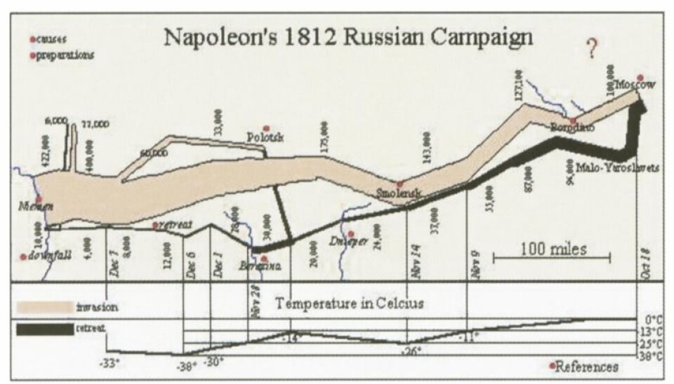
Other versions presented more dynamic and integrated versions of the variables time, geographical place and temperature than the analogue map had done – and in this way perhaps also strengthened the notion that temperature played a completely integral role.
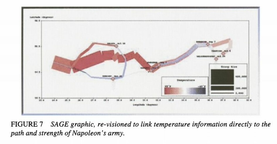
Friendly concludes the article, however, by establishing that, even if there was great potential in digital revisions and versioning, one could only hope that Minard’s original design would continue to inspire. And it certainly has, like Norbert Landsteiner’s interactive chart.
Looking with a gaze from the east
Minard has really attempted to inspire, and a very interesting contribution to the succession of variations on the original map is ‘1812: When Napoleon Ventured East’, created by the Russian news agency TASS in 2017.
(Video: Preview of TASS' production)
This prize-winning version can be understood as a comprehensive interactive commentary to Minard’s map in which TASS’s data visualisations studio, under the auspices of Alexei Novichkov, carries out a critical analysis of Minard’s French version, based on the sources and historical analyses of the time (Minard himself built his version based on five contemporary French written sources, referred to briefly in the map’s legend).
In ‘1812: When Napoleon Ventured East’, the presentation of Napoleon’s campaign is considered from a Russian perspective, which by necessity provides the story about the war with a catastrophic result another aspect: The Russian army’s participation in that which, in Russian historical writing, has been given the name ‘The Patriotic War’. In this version, the Russians are added to the graphic representations, and the French loss is placed alongside those on the Russian side.
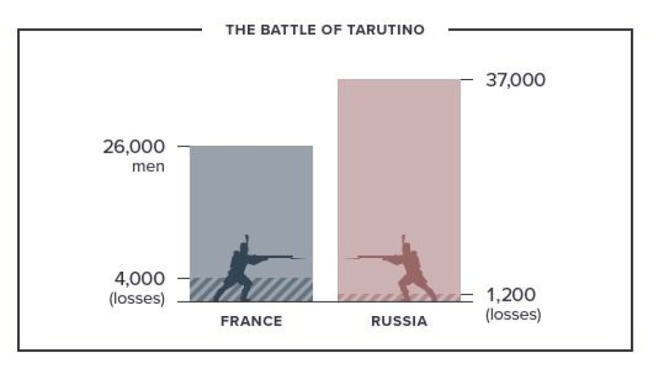
The version explains in detail, including with graphic presentations and with the help of quotations from French and Russian war memoirs, how the French army met with challenges that resulted in Napoleon’s much used and, until that point, successful military strategy did not work – with fatal results.
‘1812: When Napoleon Ventured East’ provides Minard’s version with nuances, and gives us much more detailed accounts than the one single map alone can do. It takes correspondingly much longer to acquaint oneself with exactly what the campaign involved in the format that the designers chose for the version: A comprehensive, dynamic internet article. The map and the article are two versions of the same historical event whereby the most recent complements the original with an alternative perspective and more information.
For example, ‘1812: When Napoleon Ventured East’ draws great attention to how Napoleon’s army, even at the start, suffered from a poor supply of food, and that this became an increasingly large problem. Including the weather as a variable, as Minard did, provided opportunities to see a clear correlation between the cold and the number of deaths.
However, the presentation says nothing as to whether there was a causal relationship between the two. In this respect, the Russian version contributes with one further important variable: The lack of food, in addition to the accounts of the skirmishes between the two armies in the course of the campaign. Perhaps these two were equally important explanations for the deaths, as the weather?
Napoleon went east, but where do today’s foreign fighters come from?
Charles Joseph Minard has not solely inspired presentations of the same historical event, or to a redesign of the map itself. Minard’s way of combining flow charts and maps in figurative presentations have become established as a conventions within data visualisation and infographics: ‘the flow map’, mentioned in the introduction. In this way it is difficult to point out what are, and what cannot be, specific actualisations of Minard’s method. But then examples emerge in which the source of inspiration seems to be evident, such as in the Italian Alessandro Zotta and Density DesignLab’s ‘On their way’, from 2016.
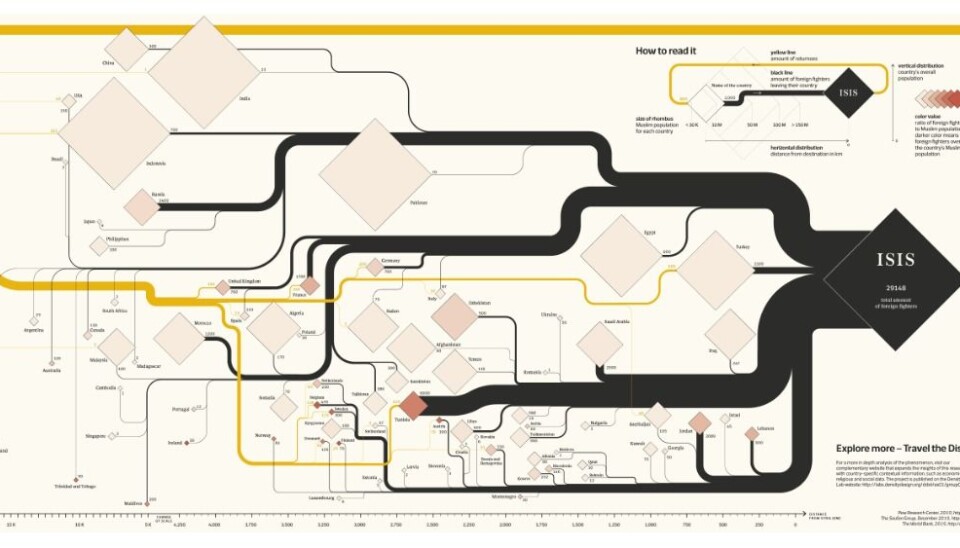
‘On their way’ (published originally in Italian in the newspaper Corriere della Sera’s Sunday supplement) provides, in a reflection of Minard’s design, a graphic presentation of the foreign fighters’ routes from their own home countries to join IS, and then their ways to travel home again.
In terms of colours, those of the original presentation are turned on their head: Black marks those travelling out, whilst yellow-brown marks those returning home. Zotta’s presentation operates, incidentally, with other variables than those that Minard used, because the theme is, after all, only loosely related.
Furthermore: The large number of sending countries, and the fact that IS cannot be placed geographically in a traditional sense, result in the map itself being more of an abstract character. The source of inspiration seems, however, to be easy to trace if one is aware of the classics of data visualisation’s design history.
Data visualisations taking a particular position
Edward Tufte understands Minard’s map as a clear anti-war declaration, with its conspicuous presentation of the loss of human life.
This way of interpreting the intentions behind the design can draw on support from the map that Minard chose to publish together with the presentation of Napoleon’s campaign: The Carthaginian general Hannibal’s crossing from Spain, through France and over the Alps on the way to Rome in 218 B.C.
In this map, too, attention is directed towards the human lives that were lost en route (of the 94 000 soldiers to leave Spain, 26 000 reached Torino, according to Minard’s map).
In the same way that Minard allows us to construct a notion of the historical events based on the variables that are included on the map, where the icy cold Autumn months during which Napoleon’s retreat took place create the basis of a narrative about the remainders of an army that fought as much against the cold as the enemy, the synthesis of the two maps allows us the possibility of thinking that what Minard wanted to show, was what warfare first and foremost is: Loss of human life.
Resources:
Landsteiner, Norbert (2013): ‘Charles Joseph Minard: Napoleon's Retreat From Moscow (The Russian Campaign 1812-1813) An Interactive Chart’ https://www.masswerk.at/minard/
Tass Russian News Agency (2017): ‘When Napoleon ventured east’, https://1812.tass.ru/en
Zotta, Alessandro (2016): ‘On their way. The Journey of Foreign fighters’ http://alessandrozotta.it/on-their-way/
Sources:
Friendly, Michael: ‘Visions and Re-Visions of Charles Joseph Minard’, Journal of Educational and Behavioral Statistics, Spring 2002, Vol. 27, No. 1, pp. 31-51. Available at http://www.datavis.ca/papers/jebs.pdf [downloaded 24.01.2019]
Kraak, Menno-Jan (2014): Mapping Time. Illustrated by Minard’s map of Napoleon’s Russian Campaign of 1812, Esri Press, Redlands
Rendgen, Sandra (2018): The Minard System. The Complete Statistical Graphics of Charles-Joseph Minard, Princeton Architechtural Press, New York
Tufte, Edward (2006): Beautiful evidence, Graphics press LLC, Connecticut


